Apple Broke Your Open Rate. And Your Subject Line Tests.
Every article about Apple Mail Privacy Protection says open rates are unreliable. None of them explain the part that actually changes your decisions: MPP doesn't add random noise, it systematically compresses the measured gap between two subject lines by roughly 3x — which is why so many creators ran good tests, saw flat results, and concluded subject lines don't matter.
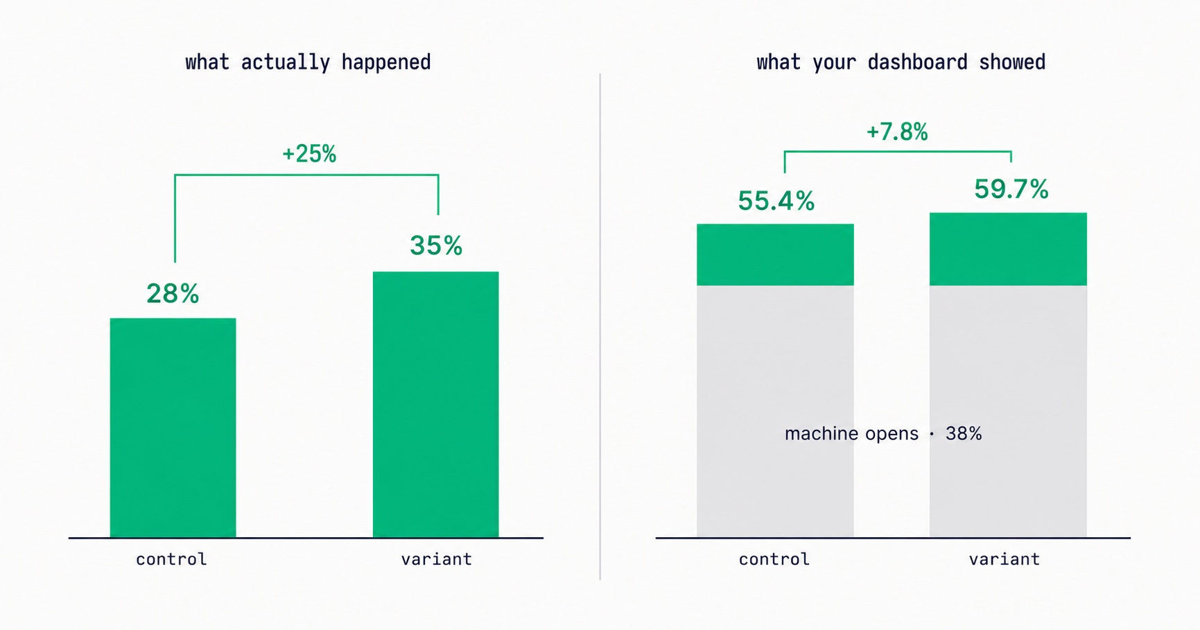
If you have run subject line tests, seen differences of two or three percentage points, and concluded that subject lines do not matter much for your audience — the tests were working. The measurement was flattening the result.
Apple Mail Privacy Protection does not merely make open rates noisy. It systematically compresses the measured difference between two variants, by a factor that depends on how much of your list uses Apple Mail. At a typical share, a subject line that genuinely improved real human opens by 25% shows up in your dashboard as a 7.8% improvement.
That is the part almost nobody explains. Every article on MPP says open rates are unreliable and you should use clicks. True, and incomplete — because "unreliable" sounds like random noise that averages out, and this is not noise. It is a fixed floor sitting under both variants, and it biases in one direction every time.
What Apple actually changed
Mail Privacy Protection shipped with iOS 15 in September 2021. When a subscriber enables it, Apple routes email through its own proxy servers and pre-loads remote content — including the invisible tracking pixel that email platforms use to register an open.
The pixel fires on delivery. Not when a person reads the message.
So an Apple Mail user with MPP active is recorded as having opened your newsletter whether they read every word, archived it unread, or have not touched that inbox in a year. Your platform cannot distinguish between those cases, because from its perspective the same event occurred.
MPP also masks the subscriber's IP address. That breaks two things people forget: geographic data derived from the open pixel, and device detection. If your analytics say most of your audience reads on mobile in a particular region, some of that is describing Apple's proxy infrastructure rather than your readers.
The compression arithmetic
Here is why this damages decisions rather than just adding uncertainty.
Machine opens fire regardless of your subject line. The proxy pre-loads the pixel whether the subject line was brilliant or terrible. So every A/B test you run has a fixed block of identical responses in both variants — sitting in the numerator and the denominator of each.
Work it through. Assume 38% of your list generates automatic opens.
Variant A has a genuine human open rate of 28%. Variant B, a better subject line, achieves 35%. In reality B is 25% better than A.
What your dashboard shows:
- Variant A: 0.38 + (0.62 × 0.28) = 55.4%
- Variant B: 0.38 + (0.62 × 0.35) = 59.7%
Measured improvement: 55.4% to 59.7% — a 7.8% relative gain.
A subject line that genuinely lifted human opens by a quarter appears as a 7.8% improvement. The signal is compressed roughly threefold.
And the compression scales with your Apple share. Two creators running identical experiments on identical audiences will reach different conclusions about whether subject lines matter, purely because one audience prefers iPhones.
- At 20% machine opens, a true 25% lift measures as 13.2%.
- At 38%, it measures as 7.8%.
- At 55%, it measures as 4.7% — small enough to read as noise and get discarded.
A creator with a heavily Apple audience will run good tests, see differences that look marginal, and rationally conclude the variable does not matter. That conclusion is an artifact of the measurement.
Find your own compression factor
Before acting on any of this, work out how large the problem is for your specific list, because the effect scales directly with your Apple share.
Check your email client breakdown. Most platforms report opens segmented by client somewhere in analytics. Look for the share attributed to Apple Mail or an equivalent privacy label. That share is roughly your machine-open floor.
Compare filtered and unfiltered open rates if your platform reports both. The gap between them is the distortion stated directly.
Look for the signature. An open rate that jumped noticeably in late 2021 and never came back down, with no corresponding change in clicks, is the fingerprint. A lot of creators attributed that jump to improved content at the time.
Compute the factor. With machine-open share m, a true relative difference gets compressed by roughly 1 ÷ (1 − m) on the underlying rate, and considerably more on the relative gap between two variants. You do not need precision here — you need to know whether your tests are being flattened slightly or crushed, because those call for different amounts of concern.
Benchmarking your headline number against category norms is still useful for orientation, and the open rate benchmark checker is built for that — just interpret the result knowing everyone's number is inflated by their own client mix.
Three other things MPP quietly broke
Sponsorship pricing
Open rate is the number sponsors evaluate, and it is inflated by a factor that depends on your audience's device preferences rather than anything you did.
This distorts the market in both directions. A creator with a heavily Apple audience reports a higher open rate and commands better rates for identical actual engagement. A creator with an Android and Gmail-heavy audience looks weaker than they are.
If your open rate has looked stubbornly low against peers covering the same subject, client mix may be a large part of the explanation. The practical response is to lead with click-based metrics in your media kit — covered in newsletter sponsorship pricing — and to be the creator who volunteers the honest number. That is a differentiator in a market where most quote the inflated one.
Content decisions
Deciding what to write more of based on which issues had the highest open rate means partly deciding based on which issues happened to reach a slightly different slice of your Apple cohort. The signal is much weaker than it looks, and treating it as strong steers your content by noise.
List hygiene automation — the worst one
This is the most damaging and the least noticed.
Almost every re-engagement and sunset workflow triggers on "hasn't opened in X days." For MPP subscribers that condition never becomes true. The pixel keeps firing forever.
So your automation permanently fails to identify dormant Apple subscribers while correctly identifying dormant Gmail ones. Over time you sunset your engaged non-Apple readers and retain dead Apple addresses indefinitely — the exact opposite of the intended behaviour, quietly degrading sender reputation for years.
The fix takes an afternoon: rebuild every automation trigger on "hasn't clicked in 180 days" rather than opens. MPP pre-loads images; it does not click links. Your reactivation campaigns should use the same definition, and so should the churn number in your growth ceiling calculation — an open-based churn rate will read artificially low and make your ceiling look higher than it is.
Send-time optimization — the one nobody mentions
This one is worth its own heading because it is completely invisible and most creators have it switched on.
Send-time optimization works by recording when each subscriber opens your emails, finding their personal pattern, and scheduling future sends to match. It is a standard feature and it is a genuinely good idea.
It runs on open timestamps.
For MPP subscribers, the open timestamp is when Apple's proxy pre-fetched the pixel — which correlates with your send time and Apple's infrastructure scheduling, not with when the human read anything. Feed that into a send-time optimizer and it learns a pattern from machine behaviour, then confidently schedules future sends around it.
The result is an optimizer that is, for a large share of your list, optimizing against noise while reporting that it is working. There is no error state. The feature does exactly what it was built to do, on data that stopped meaning what it used to mean.
Practical response: if your platform lets you exclude MPP subscribers from send-time modelling, do it. If not, treat send-time optimization as a weak-confidence feature rather than a reliable one, and do not let it override a consistent publishing schedule — predictability is worth more to your subscribers than a personalised send hour derived from proxy timing. Automation setup is covered in email automation sequences.
Why this hit creators harder than large brands
Large email programmes absorbed MPP reasonably well. Creator newsletters absorbed it badly, and the reason is structural rather than a matter of sophistication.
Sample size. Compression reduces the measured effect. A brand sending to two million people can still detect a 7.8% relative difference reliably, because the sample is large enough that the confidence interval is narrow. A creator sending to 6,000 people cannot — the same real effect is now both smaller in measurement and buried in wider variance. The test does not just get harder to read; it crosses from detectable to undetectable.
Audience skew. Creator newsletters, particularly in design, tech, media, and lifestyle, tend to have audiences that over-index on Apple devices. Higher m means harsher compression, applied to exactly the people running the smallest tests.
Nobody to notice. A brand has an analyst who reads release notes and adjusts the measurement plan. A solo creator has a dashboard that kept working and a number that went up, and no reason to suspect the metric changed meaning underneath them.
Advice lag. A large amount of creator email advice was written before September 2021 and is still circulating unchanged, still recommending open rate as the primary optimisation metric. Following current advice from a pre-MPP source produces confidently wrong decisions.
The combined effect is a cohort of creators who ran reasonable experiments, got flattened results, and concluded that a variable which genuinely matters does not. That is a worse outcome than knowing nothing, because it produced a false belief rather than an acknowledged gap.
What to measure instead
Click-to-delivered. Clicks divided by successful deliveries. MPP does not click links, so both numerator and denominator are clean.
Note the denominator specifically. Click-to-open rate is broken, because its denominator is the inflated open count — a creator with heavy Apple share shows artificially depressed CTOR purely from denominator inflation, not weaker content. Click-to-delivered survives intact.
Reply rate. Requires a human and is the strongest engagement signal mailbox providers weigh. Worth asking for explicitly in your welcome sequence, where reply rates are highest.
Click-based dormancy for hygiene. As above. The single highest-value fix in this article.
Filtered open rate, where available. Some platforms identify likely MPP opens by inspecting the requesting user agent and IP range against Apple's published proxy infrastructure, and report a filtered figure alongside the raw one. Where available this is the best option, since it preserves a metric everyone already understands. Which metrics are worth a dashboard is covered in newsletter analytics.
How to test subject lines now
Test on clicks, not opens. A better subject line brings more of the right people into the email, and more of the right people produces more clicks. Click-to-delivered captures the full effect without the machine-open floor underneath it.
The cost is real: click rates are lower than open rates, so you need a larger sample to detect a reliable difference. That is a smaller cost than running clean experiments against a measurement that compresses your results threefold and tells you nothing works.
Segment Apple Mail out of the test where your platform allows it. If you can exclude the MPP cohort from the test population, the remaining opens are genuine and the compression disappears. This is the cleanest approach and support for it varies by platform.
Test bigger differences. Given compression, testing two subtly different phrasings is close to pointless — the real difference is small and the measurement shrinks it further. Test structurally different approaches: a question against a statement, a specific number against a general claim, curiosity against clarity. If the underlying effect is large enough, it survives compression. The subject line tester is useful for generating genuinely distinct variants rather than minor rewrites.
Run tests longer. Smaller usable signal means more sends before a result is trustworthy. Three tests run properly beat twelve run on insufficient data.
Writing craft matters more than ever here, precisely because only large differences are measurable — the fundamentals in subject line templates and writing newsletters people actually read do more work than micro-optimisation ever will.
A post-MPP metrics dashboard
If you are rebuilding what you track, this is a defensible set. Four numbers, each chosen because MPP cannot touch it.
Click-to-delivered, tracked weekly. Your primary engagement metric and the one that replaces open rate for every decision that used to run on it. Watch the trend rather than the absolute value — a slow decline is the earliest warning of content drift, list decay, or a deliverability problem developing.
Clicking subscribers as a share of the list, tracked monthly. Distinct from click-to-delivered because it counts people rather than clicks, so a small group of highly active subscribers cannot mask a broadly disengaging list. This is also the number to base dormancy on.
Cohort retention at 30, 60, and 90 days. Of everyone who joined in a given month, what share is still clicking? This is the single most diagnostic number about acquisition quality, and it tells you which signup sources produce subscribers who stay. Most creators have never looked at it, and it usually reveals that the source converting best converts worst in the long run. It also feeds directly into the churn figure in your growth ceiling calculation.
Reply rate on the welcome sequence. A direct human signal, a strong deliverability input, and the best qualitative audience research available. If you are not asking one specific, easy question in your first email, you are leaving the highest-response moment of the entire subscriber relationship unused.
Keep open rate on the dashboard as a secondary trend line with a note about what it does and does not mean. Do not delete it — just stop letting it decide anything. Which signup sources feed those cohorts is a landing page question as much as a content one, covered in optimizing your signup page.
Where this argument has limits
The 38% figure is illustrative. Your actual Apple-with-MPP share might be 20% or 55%, and the compression scales directly with it. Check yours before assuming mine.
Not every Apple Mail user has MPP enabled, so treating the entire Apple share as machine opens overstates the effect somewhat. The direction is unambiguous; the magnitude for your list requires your data.
Filtering is imperfect. Detection depends on identifying Apple's proxy infrastructure, which is neither exhaustive nor permanently stable. A filtered open rate is much better than an unfiltered one and it is not a clean human count.
Click-to-delivered has its own confound. It blends engagement with deliverability. A newsletter with excellent content sitting in everyone's promotions tab shows a weak click-to-delivered rate that looks like a content problem and is actually an authentication problem. Check your setup in the deliverability guide before drawing conclusions about your writing.
And clicks measure something different. A subject line that gets people in and then disappoints them looks bad on clicks even though the subject line did its job. You are trading a metric with a known bias for one with a different known bias — an improvement, not a solution.
Open rate is not worthless. It remains useful for tracking your own list against itself over time, provided your audience composition stays stable. It is specifically unreliable for comparing across creators and for detecting small differences in experiments — which are the two things most people use it for.
Frequently asked questions
Should I stop reporting open rate entirely?
No. Keep tracking it for your own trend line, where a stable audience composition makes it a reasonable directional signal. Stop using it to compare yourself against other creators, and stop using it as the decision metric in A/B tests. Report click-to-delivered alongside it wherever the number goes in front of a sponsor.
Why did my open rate jump in late 2021 and stay high?
Almost certainly MPP rolling out across your Apple Mail subscribers. If clicks did not rise proportionally over the same period, the jump was machine opens rather than a genuine engagement improvement. A lot of creators celebrated that jump at the time and built rate cards on it.
Can I just exclude Apple Mail users from my tests?
If your platform supports segmenting by email client, yes — and it is the cleanest solution available, because the remaining opens are genuine and compression disappears entirely. The caveat is that you are then testing on a non-representative slice of your audience, so a subject line that wins among Gmail users may not be the winner overall. In practice the bias is usually small enough to accept.
Does MPP affect deliverability?
Not directly. What it affects is your ability to detect deliverability problems, since the open rate that would normally signal a placement issue is propped up by machine opens. A newsletter sliding into the promotions tab shows a smaller open rate decline than it should, which delays diagnosis. Watch click-to-delivered for the real signal.
Do the same problems apply to Gmail?
Gmail caches images through its own proxy, but it does so at open time rather than delivery time, so the distortion is far smaller. It affects geo and device data from the pixel more than it affects the open event itself. Apple MPP is the dominant issue.
The practical consequence is that your open rate distortion is driven almost entirely by what share of your audience is on Apple devices — which is why two creators in the same niche can report open rates fifteen points apart while having identical real engagement. Before comparing your number to anyone else's, check whether you are comparing audiences or comparing hardware preferences.
My list is small. Is subject line testing even worth it?
Below roughly 2,000 subscribers, formal A/B testing is genuinely not worth the effort — compression plus small samples means almost nothing reaches statistical significance, and you will spend months collecting results you cannot trust. That is not a reason to ignore subject lines; it is a reason to improve them through craft rather than measurement.
Write the subject line last, after you know what the issue actually says. Make it specific rather than clever. Read it as a subscriber scanning forty other messages and ask whether it gives them a concrete reason to open now. Those judgments outperform an underpowered test at small scale, and once you are past the point where testing works, you will already have built the instinct. Broader small-list strategy is covered in monetizing under 1,000 subscribers.
What is the single fix if I only do one thing?
Rebuild your dormancy and re-engagement triggers on clicks instead of opens. It takes an afternoon, it corrects an automation that is currently doing the opposite of its intent, and it protects the sender reputation that everything else depends on.
Measure what a human actually did
InfluencersKit reports click-based engagement and click-defined dormancy alongside open rate, so your hygiene automation targets the right subscribers.
Stay Updated
Get the latest insights, strategies, and tips delivered directly to your inbox. Join thousands of creators who are building their email communities with our weekly newsletter.
No spam, unsubscribe at any time. We respect your privacy.
Related Articles
Newsletter Analytics for Creators: The 8 Metrics That Actually Matter (And 5 to Ignore)
A 60% open rate sounds great until you realize it's from 800 people and you're earning $0.08/subscriber. The metrics that actually predict newsletter success — revenue per subscriber, engagement score, churn rate, CPM efficiency, subscriber LTV — and what good looks like at every stage.

Your List Grew 1,500 Overnight. None of Them Are Real.
A signup spike with no launch behind it is usually list bombing. Fifteen hundred fake signups can push a welcome stream to six times Gmail's complaint limit and overstate your list by 30% to sponsors. How to spot them, why Apple Mail hides some, and how to clean up without making it worse.

Moving Your Newsletter? The List Is the Easy Part.
The CSV moves in five minutes. Sender reputation, unsubscribes, paid subscriptions, automations and old signup forms do not. The order that gets a newsletter to a new platform without losing inbox placement or emailing people who opted out.

A Subscriber Is Worth $1.25 a Year. Now Price Your Ads.
Two sponsored slots at a $30 CPM with a 40% open rate earn about $1.25 per subscriber per year. Against a defensible CAC near $2 and cost-per-signup commonly $2-5, most paid acquisition is at or past break-even before you account for paid cohorts converting worse than organic ones.
Your Free-to-Paid Rate Is Two Numbers Pretending to Be One
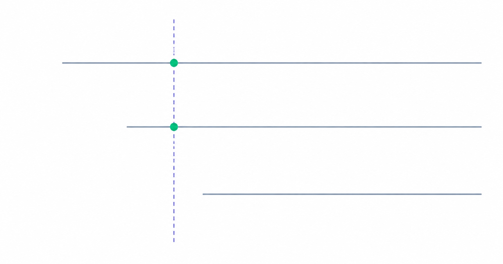
Long-tenured subscribers convert three to five times better than new ones, and later cohorts are acquired more broadly than early ones. Both effects correlate with join date, so they cancel inside your blended conversion rate — and the two situations they describe call for completely opposite responses. The same-tenure comparison that separates them.
Your Newsletter Has a Growth Ceiling. Here's the Formula.
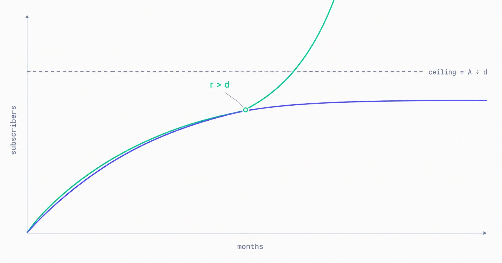
Your list has a maximum size you can calculate today: monthly new subscribers divided by monthly churn rate. At 500 signups a month and 2% churn, you will approach 25,000 and stop — no matter how long you keep publishing. The math behind the plateau, why halving churn beats doubling acquisition, and the one term that removes the ceiling entirely.

Newsletter Reactivation: How to Win Back Inactive Subscribers (With Templates)
Every newsletter has inactive subscribers silently dragging down deliverability. A well-designed reactivation campaign recovers 8–20% of them while identifying the truly unrecoverable. The four-part reactivation sequence, subject lines that break through inbox habituation, the list hygiene logic that improves metrics after removal, and the onboarding system that prevents inactivity from accumulating in the first place.

Email Marketing for Online Coaches: Build Your List, Nurture Prospects, Fill Your Program
Coaching has a long sales cycle — clients need weeks of trust-building before they commit. Email is the only marketing channel that matches this cycle structurally. The complete system: how to build a list that attracts your ideal client profile, the 7-email welcome sequence that pre-qualifies prospects, and how to run enrollment conversations through email without feeling salesy.
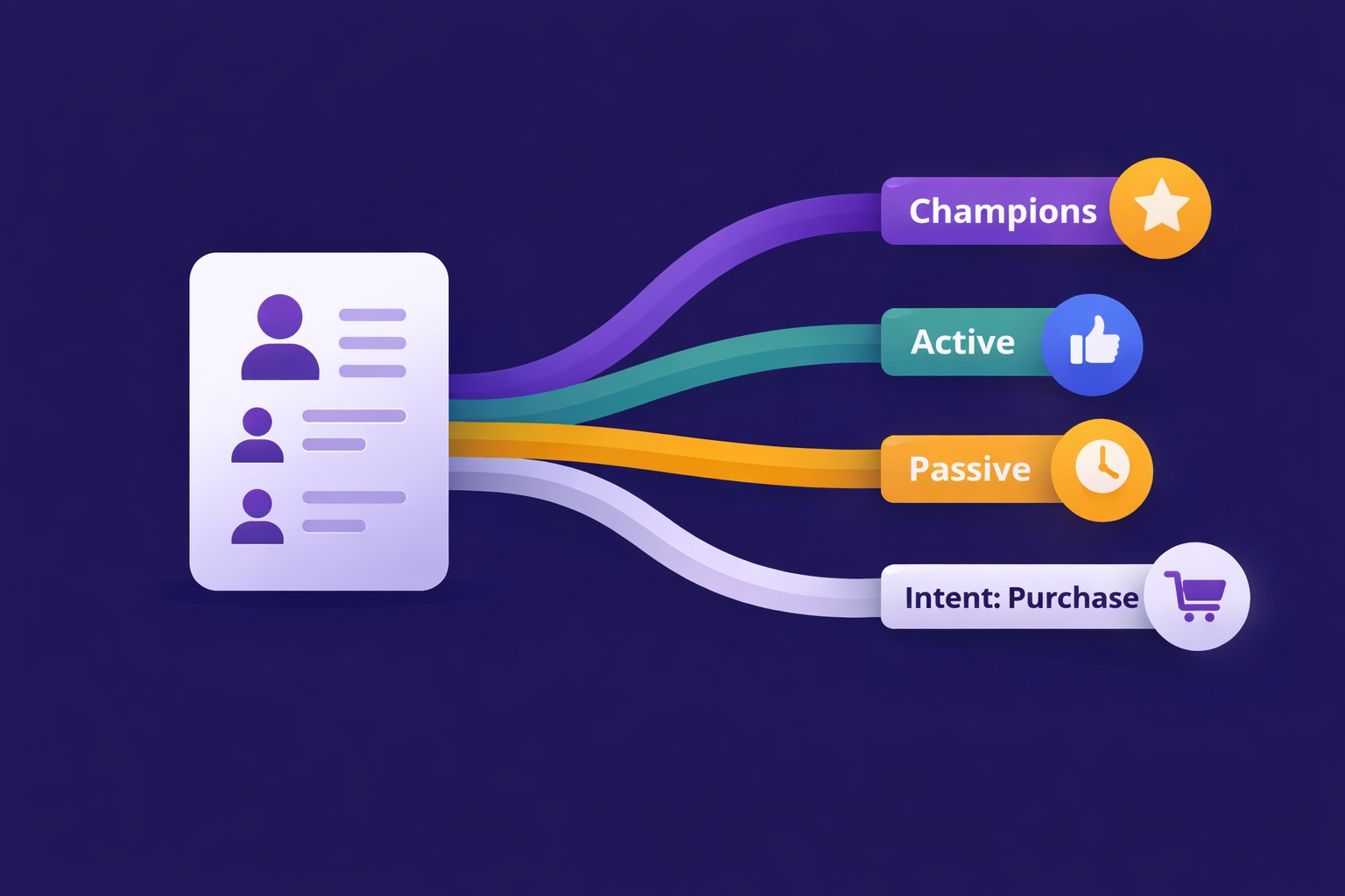
Newsletter Segmentation for Creators: Send the Right Email to the Right Subscriber
Segmentation is the gap between 25% open rates and 45% open rates — and between 3% paid conversion and 9%. The 5 segmentation types that move the needle, the exact tags to set up from day one, and how to build a behavioral targeting system that runs automatically in InfluencersKit.
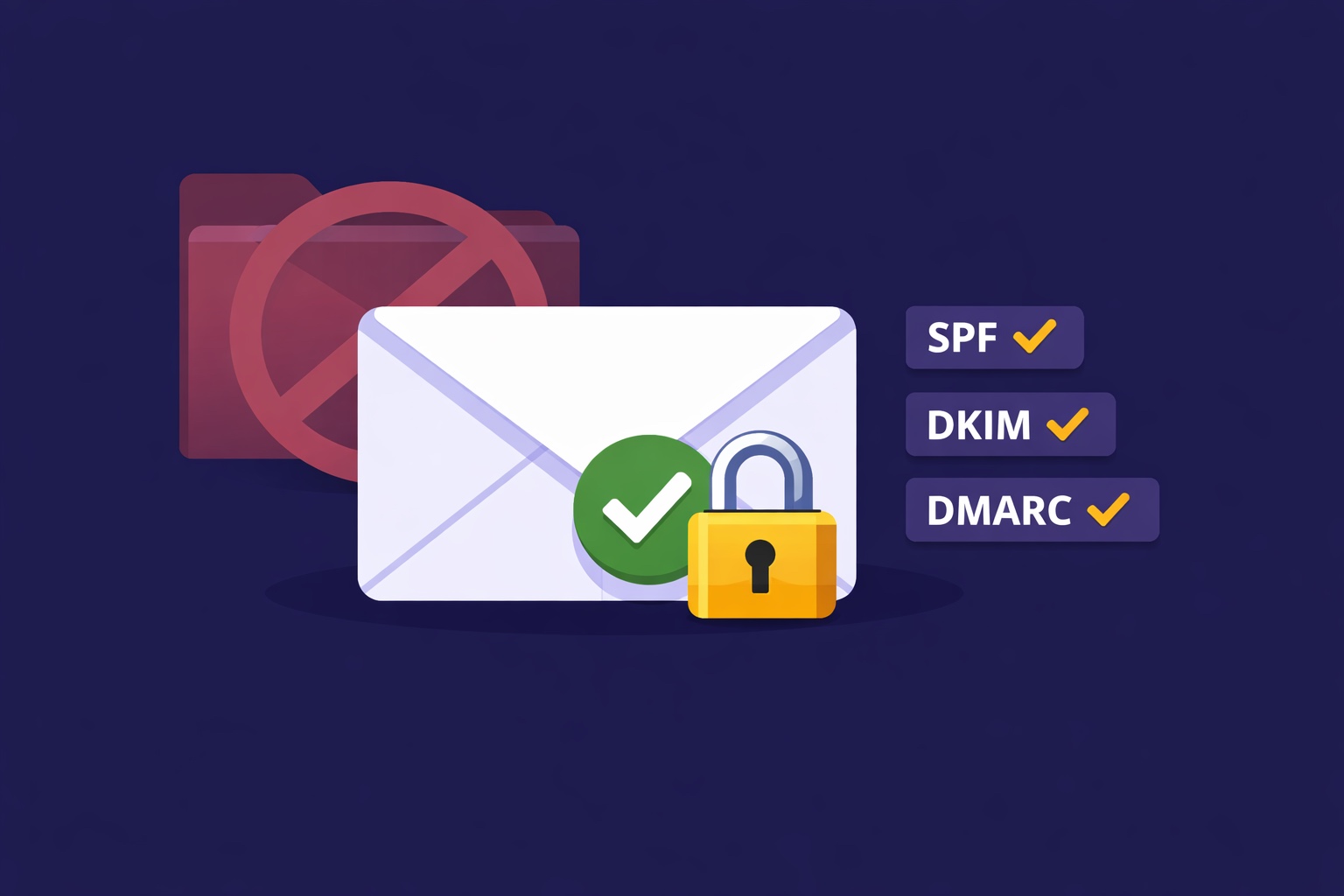
Email Deliverability for Newsletter Creators: Why Your Emails Land in Spam (And How to Fix It)
Deliverability is the silent newsletter killer — a 30% spam rate cuts your revenue potential by 30% while your dashboard shows 98% delivered. SPF, DKIM, DMARC in plain English, list hygiene that protects your sender reputation, the tools to diagnose the problem, and a 7-day recovery plan.
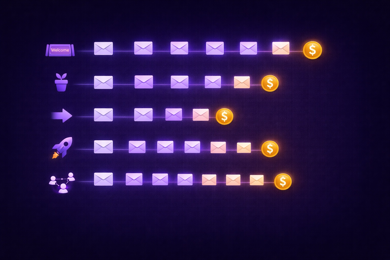
Email Automation for Creators: Set Up These 5 Sequences Once and Earn Forever
Most creators think automation means a welcome email. The reality: 5 automated sequences running simultaneously can generate $2,000–8,000/month passively. The complete guide with exact email timing, subject lines, content frameworks, and setup walkthrough for every sequence.
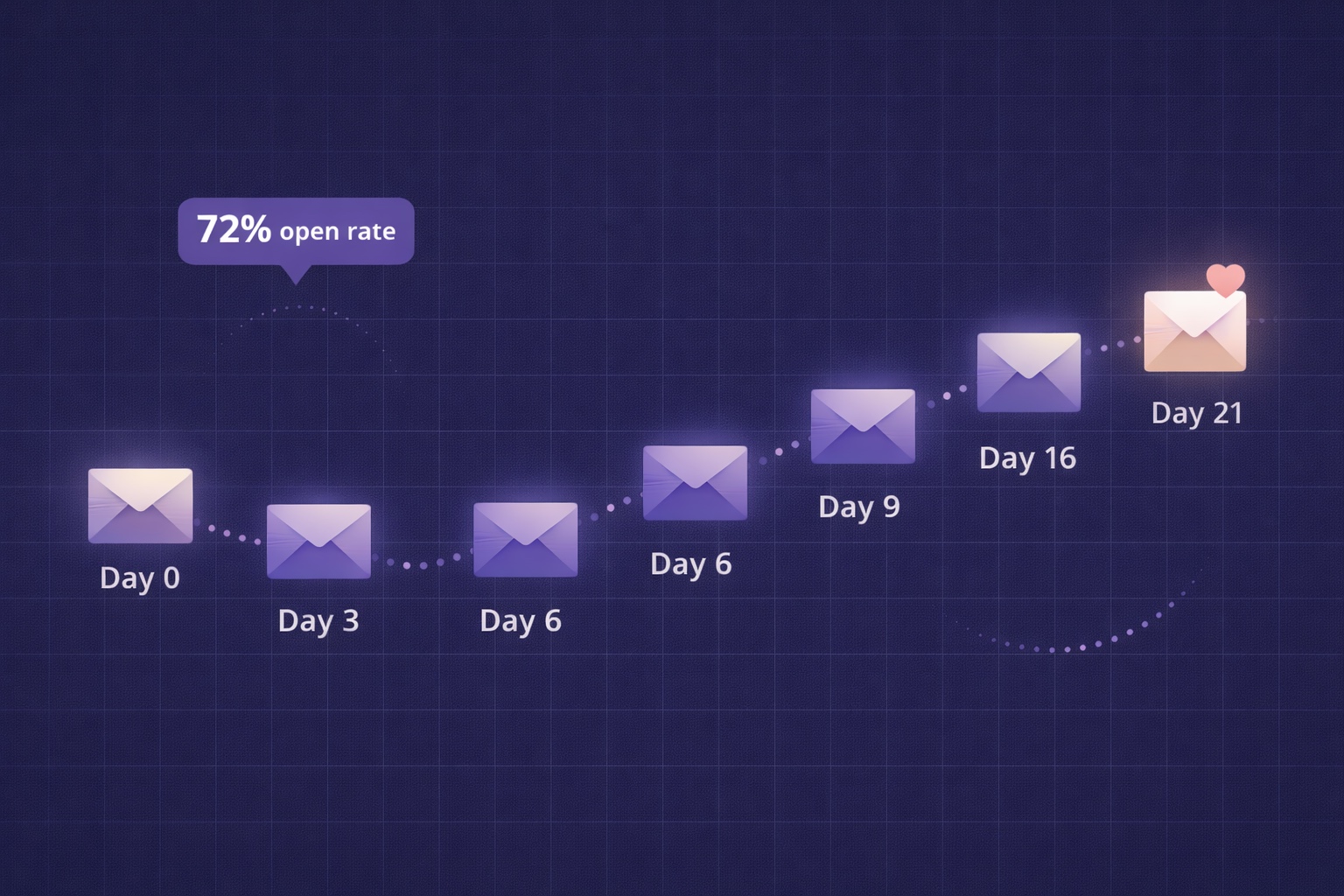
Newsletter Welcome Email Sequence: The 7-Email Series That Turns Subscribers into Superfans
Your welcome email gets a 50-80% open rate — the highest of any email you'll ever send. Most creators waste it with a single 'thanks for subscribing.' This is the exact 7-email sequence with day-by-day timing, subject lines, full content frameworks, and automation setup in InfluencersKit.